buffo
buffoI like that idea, Chris! Though I think it might be easier if the scanners were on the far right...
David, what do you think? Is this one doable?
Adam

I like that idea, Chris! Though I think it might be easier if the scanners were on the far right...
David, what do you think? Is this one doable?
Adam
Fifteen Characters...
"Information not shared, is information lost forever"
Join ILDA
Support Photonlexicon
 Senior Member
OK how about this? Of coarse all of the black lines would need to be white on a black shirt.Originally Posted by buffo

Senior Member
Do you think it would be too complicated to make that full "RGB" with the colors mixing to white before hitting the scanners?David?
Love, peace, and grease,
allthat... aka: aaron@pangolin
OOOH! I like both of those designs. Very nice job guys!
Senior Member
I know it's hard to see in my drawing, but that is exactally what I did.
I don't see why it couldn't be done.
You start with red thread out of one laser and blue out of the other. Where they meet you would use magenta thread.
Simply sewing one thread over the other wouldn't look right and possibly mess up the machine.
Lazerjock
David should be back from his vacation today. I'll have him take a look and see what he says.
Adam
Senior Member
Hey guys, looks like a couple nice designs there. I'm surprised there haven't been more submissions. I'd like to give this another week or so to see if anyone else wants to submit a logo. I think most of the ones already submitted can be embroidered, I just wonder if some of them would be too big on the shirt?
el gringo loco
Hey Kats...
First, Kudos to the two-designs submitted, thus far... I enoyed seeing the effort to 'tell the story', which is what a good logo is all about..., guys!...
I sincerely hope to make 'SELEM' this year, but the show-schedule will have to dictate go/no-go on that.. aaand, I prolly have to, first, see what I can do to help give the 'poor CaLEM' a 'push' - if it will 'take'...
- but if I just can't make it, perhaps helping with this can be my 'contribution'...
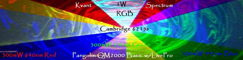
... lemme know what 'cha think - I think it 'tells the story' pretty-well - you got your 'dream-diode' (RGB, all-in-one...'making' a nice, white beam / "L", and, then back-out, gettin down 'to-business', with a nice RGB-fan, up-top...
...and it all 'just so-happens' to form a subtle 'exclamation-point'
-
Clean, bold, and should-be a relative-breeze to embroider. (But if this design proves to be 'pricey', you could reduce 'thread-count' by making the 'SELEM' and/or 2010, as 'outlines' vs solids...)
...I do kind-of like the version w/O the 'diode leads'...
...I know that is more 'technically-correct' - (you wouldn't 'see the leads', blah, blah...) - but I also thought that the 'leadless' diode made the whole 'L / beam-path device' look kinda 'baseball-batty', if that makes sense... And, yesI know that there will be Ions, there, yadda, yadda, yadda - but we don't have to get 'silly' with 'literality', here - I mean, then - where's the 'LASORB'?
I also have some other / earlier versions, but I liked this one the 'best' / think it 'tells the story' better than my earlier ones... Lemme know if you wanna see any 'tweeks' to this version / variations, and/or the 'other designs'... there's at least ONE more I wanna post - (...just for laughs.. it's fun, but not a 'serious design' for a shirt... bit too 'complicated'...)
Oh, and yes, it 'translates' pretty-well to 'on-white' (for print / signs, etc..) - I can post that later - lemme know what you think of this one, first...
Anyhoo, hope ya like it... lemme know yer thoughts...
peace..
j
....and armed only with his trusty 21 Zorgawatt KTiOPO4...
Fuck the T shirt,,,, I want one of those full spectrum diodes!!!
Yeah, that design looks really slick. I'd proudly wear that.

 Posting Permissions

 Reply With Quote