Oops, spot the deliberate mistake above? Links are not being underlined unless rolled over.

 Senior Member
Oops, spot the deliberate mistake above? Links are not being underlined unless rolled over.
Doc's website
The Health and Safety Act 1971
Recklessly interfering with Darwins natural selection process, thereby extending the life cycle of dim-witted ignorami; thus perpetuating and magnifying the danger to us all, by enabling them to breed and walk amongst us, our children and loved ones.
Senior Member
Looks good but the text is too small...
But I like the Default better... It's easier on the eyes...IMO
Jerry
See the LaserBee II and all other LaserBee LPM products here....
All LaserBee Laser Power Meter Products
New 3.2Watt RS232/USB LaserBee II LPM REVIEW
Always in stock and ready to ship....
Subsidary:-Pharma Electronic Solutions
Senior Member
Thank god for that.Originally Posted by Admin

Mmmmm "default"
Senior Member
I love it!
This is really different... and clean
Thanx;
DDL
I suffer from the DunningKruger effect... daily.
Senior Member
Its down to admin but I don't suppose it hurts to make suggestions.
I thought this one also had good potential: http://vbskins.com/theme/space-vision.html
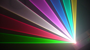
If the board was expanded to almost full screen (some thin borders maybe 1/2 what they are currently) and the space theme replaced with some colour laser beams...
Last edited by White-Light; 04-15-2009 at 06:52.
Senior Member
Ok, I switched back to default... I couldn't tell where the links were in the text...
I do like that darker theme as posted above, but I hate that the highlight color is WHITE! How are you supposed to read what you're hovering over?
--DDL
I suffer from the DunningKruger effect... daily.
Senior Member
ʌǝɹʎ sʇɹɐuƃǝ˙˙˙ ı,ɯ ɹɐʇɥǝɹ ɹǝsısʇɐuʇ ʇo ɔɥɐuƃǝ' qnʇ ı,ɯ snɹǝ ı,ןן ƃǝʇ nsǝ ʇo ʇɥǝ uǝʍ ןooʞ˙
Senior Member
yeah.. laserists have bad eyes.. go figure... the font sux.. I like the colors and the full scree display.
Some would say however that putting the theme across the entire screen causes most of the text you are reading to be at the edges of the screen... this is also more difficult as your eyes have to scan the entire screen to read anything.
I find it much easier when everything is gathered together in the center of the screen
And you actually have a set width so that changing the size of the window does not take away
from the way the theme is laid out, or make the text bounce around
thats one of the reasons i like having the avatars on the left in a forum.. it creates a buffer...
Quis custodiet ipsos custodies?
Solid State Builders Group
Senior Member
It's really interesting that you say that, but I stare at a computer screen almost 80% of my waking hours and have never noticed that to be a problem. As a matter of fact, I'm so used to a 'wide' screen and small fonts that I dislike incomplete lines...I feel it's an eye-chore for me to scan back and forth rapidly rather than move linearly in one line...
I don't doubt what you said at all... as a matter of fact, I know that canhigng the arrganemnet of the leretts in a wrod deos not affcet raednig wlihe the frsit and lsat lrettes are stil in plcae...
--DDL
I suffer from the DunningKruger effect... daily.
Creaky Old Award Winning Bastard Technologistnext gripe, I have to scroll down for a half hour in the user CP to find the send PM button, can you move that one up to the top?
On a hi-res toshiba laptop, this layout is a lot of eye strain and the font is lethal . I do like the fact that it is not the "Angry Fruit Salad" color scheme.
Steve

 Posting Permissions

 Reply With Quote
