Very nice layout.
Good job!

 Senior Member
Very nice layout.
Good job!
my webpage
http://stevemilani.jimdo.com
Skype ID: stevemilani957
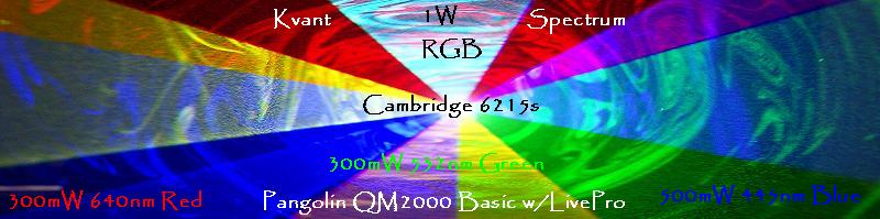
my RGB analogue projectors:
3.9 W (640/532/445) 30kpps
2.6 W (655/532/450) 30kpps
2.5 W (638/532/450) 30kpps
0.7 W (test unit)(635/532/473) 18kpps
Senior Member
I was a bit surprised by the change as well...Originally Posted by Admin

Any chance that video is still around for those of use not fortunate enough?
Thanx;
DDL
I suffer from the DunningKruger effect... daily.
Senior Member
This white is giving me eyestrain. Could we have white on black instead? Way more readable, plus it would give pictures a better contrast.
Senior Member
Yip i like it too . i like non fussy :-) ... im not that keen on black /white forums ... strange how we all like diffeent things
... your starting to look very much like digital point
http://forums.digitalpoint.com/
...and I think the layout shows how advertising can be done subtley without getting in the way with the format of this forum.
http://forums.digitalpoint.com/ = 11 million posts / 287,000 members / 71,000 Active members --- phew !
paul
Last edited by Lasermad; 07-14-2009 at 17:17. Reason: adding some stats
In the beginning there was none. Then came the light - #1 UKLEM - 2007
BUY UK LEGAL LASER POINTER :: NEW - Blue 460nm Laser Pointers
But of course. http://www.photonlexicon.com/index.z.html
I'll work on that.
The header ad is bad enough but the "second post inline ad" is far from subtle.
I might try to setup ads or something for non registered / not logged in guests but thats something I really have to think about. What would it say to potential "Addict Button!" users if their first impression is getting a face full of advertisements?
That was fantastic!
I am squinting a lot at the whiteness also.
Love, peace, and grease,
allthat... aka: aaron@pangolin
*This space intentionally left blank*
This theme *does* seem a little brighter than it's previous iterations. Maybe the boxes could be shaded a little bit darker.
I'm still happy with it though.
(I can't get enough of that 'Addict Button'; the look on the figure's face is uncanny!)
-Jonathan
Senior Member
LOL! Good stuff
Thanx! (insert addict smiley here...)
--DDL
I suffer from the DunningKruger effect... daily.
Video is awesome!
Adam
Member
Aging/lased eyeballs. It's all the same right?
I really like the new layout as well.

 Posting Permissions

 Reply With Quote
")

 Admin
Admin